Women’s access to health, education, economic opportunity and political power have been improving but the picture is very uneven geographically. Although most indicators improve with economic development the variation shows that a lot can be done even before countries reach western living standards.
*
Those who think of the International Monetary Fund (IMF) as mainly concerned with macroeconomic and financial stability might be pleasantly surprised to hear that the organisation’s research department has just published a working paper on gender equality. The study (*) by four IMF staff adds to work by the United Nations and Clinton Foundation and Gates Foundation. In sum, it shows progress in most indicators but big gaps remaining.
The study looks at the following indicators:
- Enrolment in secondary schools
- Life expectancy at birth
- Child mortality, under 5
- Maternal mortality ratio
- Labour force participation rate, aged 15-64
- Mean nominal earnings
- Seats held by women in national parliaments
These are indicators of female economic and social welfare, which are of course important for half the human race. But they are also related to wider measure of economic and social well-being because better educated and healthier women are good for children’s welfare, population control and wider social improvement. Indeed if we had to focus on only a few indicators of human progress, the education and economic opportunity for women would probably be the most useful guides to the wider progress of humanity.
Secondary school enrolment
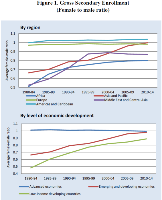
Let’s look at some of these. On secondary school enrolment (I use UK spelling) there has been a large improvement since the 1980s in less developed regions with Asia and Pacific catching up with Europe. Progress in Africa has been much less and in the Middle East and Central Asia the improvement seems to have stopped in the mid-1990s. The lower chart shows that the improvements have been less for those emerging and developing economies which the IMF classifies as low-income, which are more likely to be found in Africa.
Life expectancy
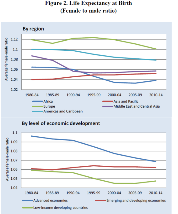
A second indicator is life expectancy at birth. The chart below shows that the ratio is above one for all regions, reflecting greater natural life expectancy for women than for men. But the gap has narrowed considerably in the advanced economies, probably because of the waning effect of smoking (which affected men more than women) and the improvement in treatment of cardiovascular diseases which were a big reason for men living less long.
Note that these figures don’t reflect the higher mortality rate of female fetuses who are aborted because of persistent preference for male children, especially in India and China, where the prospective surplus of men over women is going to make for a lot of social problems in coming decades.
Maternal mortality
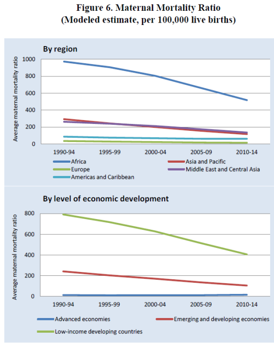
Perhaps more important is the rate of maternal mortality (death of a woman from pregnancy-related causes while pregnant or up to 42 days after pregnancy terminates, per 100,000 live births). Here we still a shockingly higher mortality rate in lower income countries though the gap with advanced economies has been shrinking. In English novels of the nineteenth century it was all to common for a mother to die in childbirth, reflecting the sad reality of the time. The evil stepmother of fairy tales is a throwback to the all too common experience of children whose father had married again after the death in childbirth of his first wife. These things are now extremely rare in the rich economies but remain too tragically common elsewhere.
Labour force participation
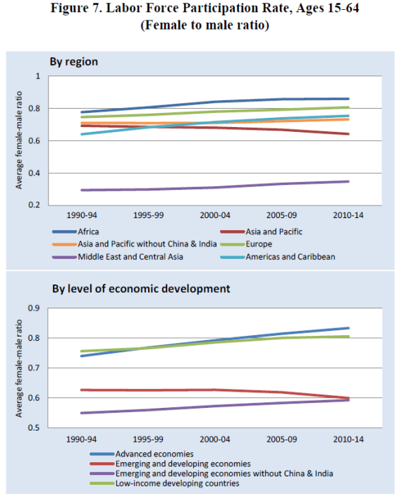
A key economic indicator is the labour participation rate of women. The next chart shows how one region, the MIddle East and Central Asia, is markedly out of line with the rest of the world. It also shows that female participation is higher in the lowest income countries and especially in Africa. Note that the ratio for Asia and Pacific declined but that is entirely owing to India and China and mainly India. Other research suggests that lower female labour participation is explained by a combination of more females enrolling in school and university plus higher household incomes leading to some women being able to stop paid work. India and China are of course very large populations so they tend to dominate the figures for Asia.
Political participation
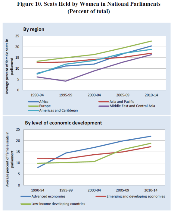
Lastly the report shows general improvement in political participation, as measured by the number of women in national parliaments. The advanced economies have the highest rate (which varies a lot within that group) but the overall trend is upwards. The absolute level remains very low though, with no region reaching 25% of the seats held by women.
Glass half full?
Things are better than they were, for the most part. But they’re still not good enough. There is much still to do
(*) The research was funded by the UK’s Department for International Development (DfID) but the report’s findings and views expressed are those of the researchers alone, not DfID or the IMF.


Leave a Reply